Peacock
Redesign
Making Peacock the single entry point for all NBC content, so users never have to leave to figure out what they can watch.
View Prototype →The Problem
NBC runs Peacock, NBC, and NBC Sports as separate products that carry overlapping content but operate on completely different access models. Peacock runs on a subscription. The NBC and NBC Sports apps require a cable or TV provider login. There is no connection between the two systems. So a Peacock subscriber who wants to watch a live game that only streams on NBC Sports has no way to authenticate and no explanation of why their subscription is not enough.
User Research
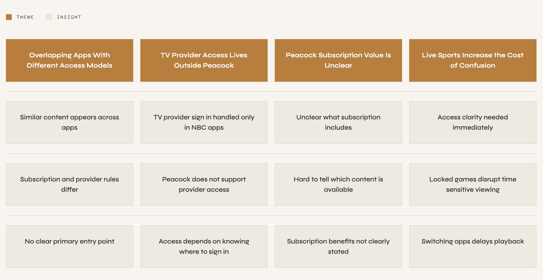
I went through App Store reviews, Reddit threads, and community forums across the NBC and NBC Sports apps and mapped everything into an affinity map.
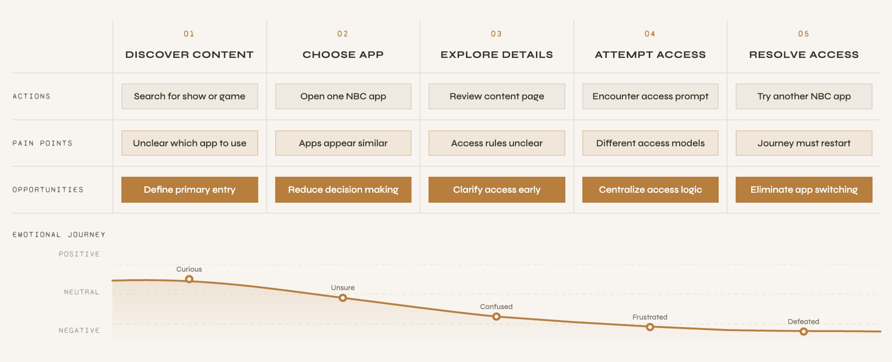
Journey Mapping
Mapping the journey made one thing clear. The problem was that the app let the users get all the way to the point of watching something before telling them they could not. By then they had already invested time and the only option was to start over somewhere else.
Research Insights
Design Direction
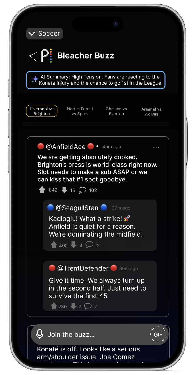
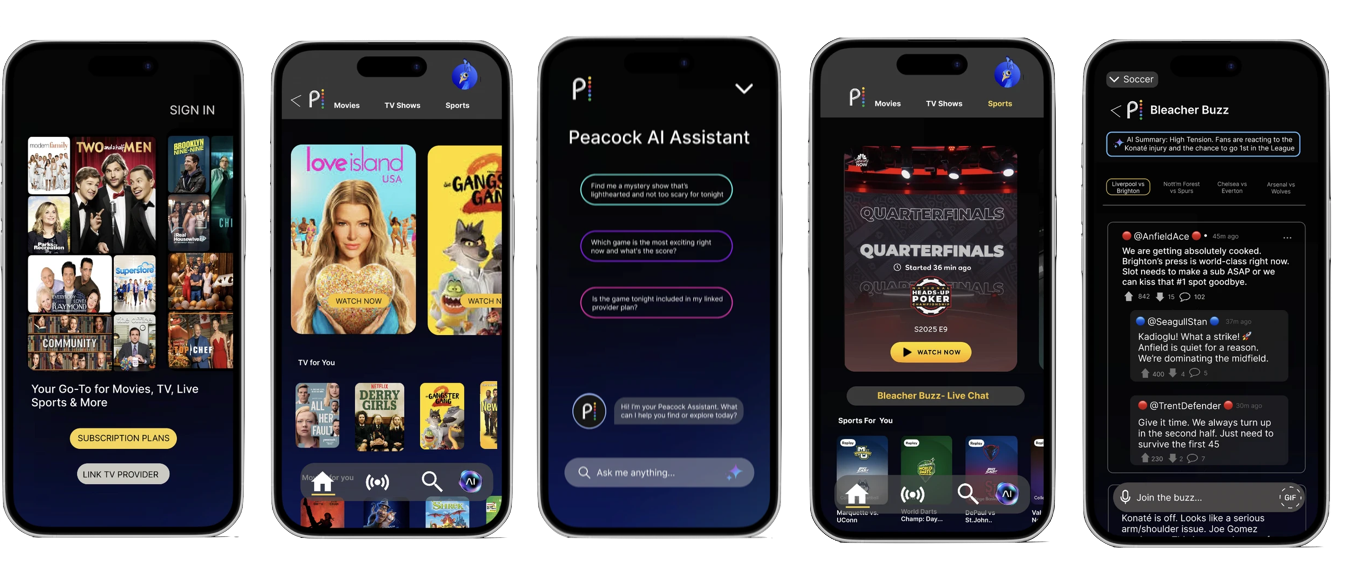
The solution needed to be one app that could handle both subscription and TV provider access while keeping the experience consistent across all NBC content. I chose Peacock because it had the strongest existing UI foundation and was the app users were already most familiar with.
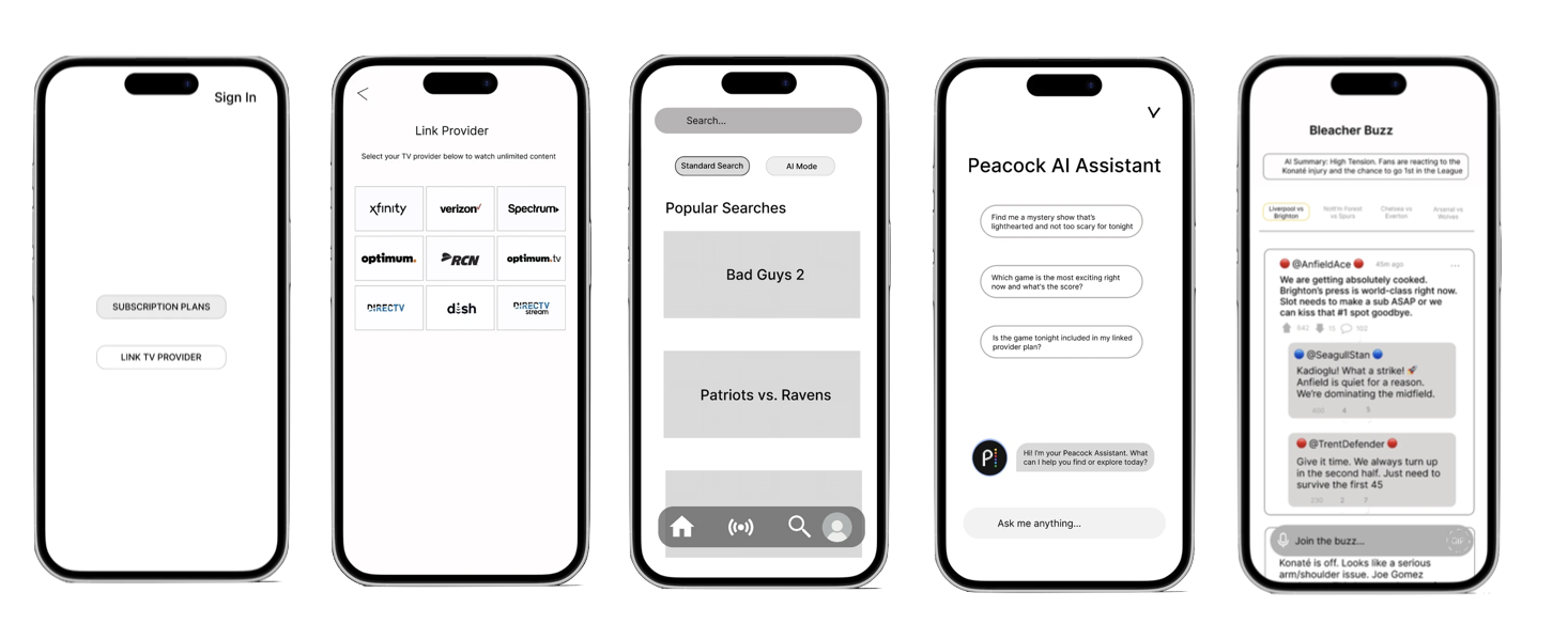
Low Fidelity
Before making any visual decisions I built low-fidelity screens to work out where each feature would live and how users would find it.
User Testing
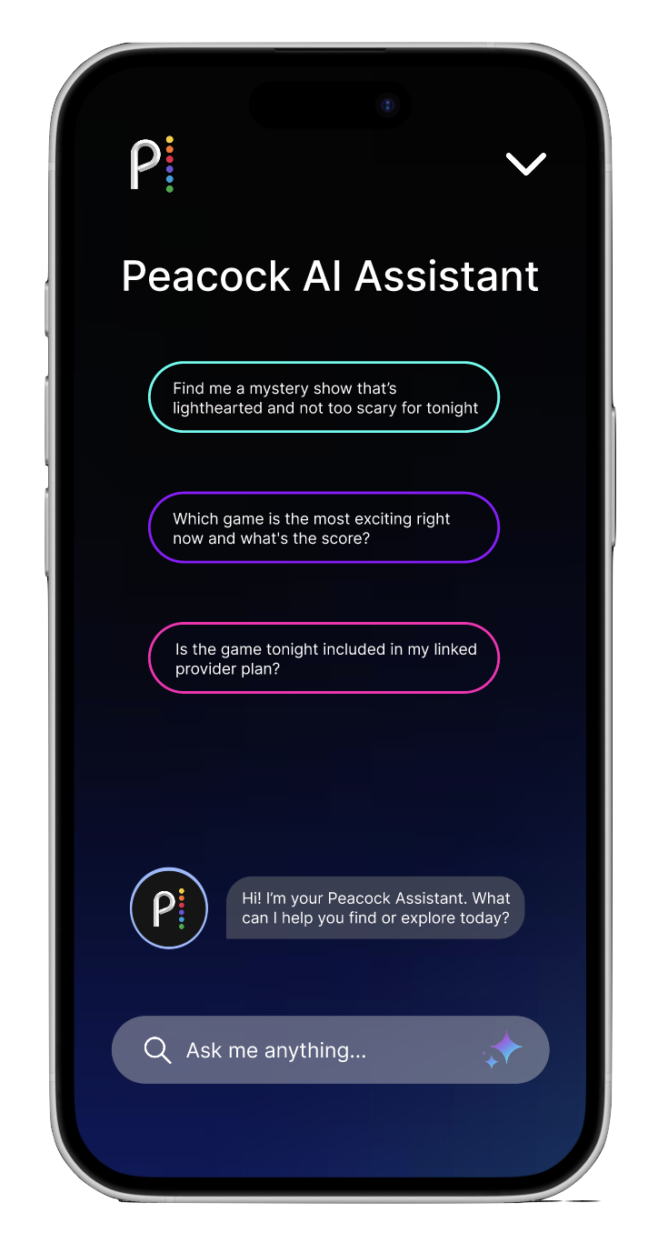
I originally placed the AI Assistant inside the Search tab because that felt like the most logical home for it. Users did not agree. Every person I tested with looked for it on the home screen first. They expected it to be immediately there, not something they had to go find.
I moved it to the home screen in the final prototype.
Design Approach
The redesign came down to three focused additions. Each one addresses a different layer of the same problem.
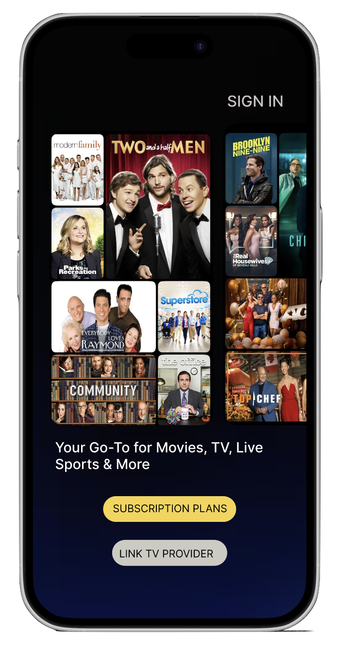
High Fidelity
The final prototype uses Peacock's existing UI patterns so the new features feel native to the app.
What I learned
I came into this thinking the problem was visual, bad screens and confusing layouts. What the research actually showed me was that the problem was structural. No amount of good UI fixes a system that was never designed to work as one thing.
Placing the AI Assistant in the Search tab felt completely logical to me, but every person I tested with went straight to the home screen first. That gap between where I put something and where a user looked without thinking was the most useful thing this project taught me.